Navy gets treated as a safe color, which is really another way of saying it gets treated as a color that only goes with white, gray, and maybe a plain button-down. That undersells it. Navy is dark and desaturated enough to behave like a neutral, but it is still a genuine blue with a real complement on the color wheel, not a shade of black. Once you treat it that way, navy stops being the piece you reach for when you cannot decide on a color and starts being the piece that opens up the most pairings in the closet.
Why navy reads as a neutral, and why that undersells it
The reason navy gets lumped in with black, gray, and beige is simple: at a glance, in most indoor light, it is dark enough to anchor an outfit the same way a true neutral does. But navy’s undertone is doing real work even when it is not obvious. A true neutral has no hue to speak of; navy’s hue is blue, and blue’s complement sits in the orange family, which is exactly why camel, rust, and burnt orange look so deliberately right against it rather than just inoffensive.
That distinction matters because it changes how you should be choosing a second color. Pairing navy with another near-neutral, gray, beige, a slightly different navy, produces an outfit that is safe but flat, two pieces that do not fight but also do not do anything for each other. Pairing navy with a color that actually relates to it on the wheel, the way complementary and analogous pairings work for any color, produces an outfit that reads as chosen rather than defaulted to.
The full navy palette
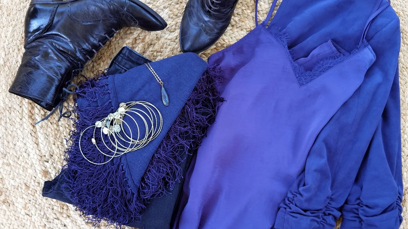
Camel, rust, burnt orange, and mustard are the four warm colors that pull the most out of navy, because they sit closest to navy's actual complement rather than just contrasting in value. A camel coat over a navy sweater, or a rust scarf against a navy suit, reads as considered rather than accidental, since the warmth of one color is doing real work against the coolness of the other instead of merely being darker or lighter than it.
Ice blue, silver-gray, and blush pink sit close enough to navy in temperature to read as calm rather than clashing, while staying distinct enough from navy itself to register as a genuine second color. Blush against navy in particular reads more polished than blush against black, since navy's blue undertone keeps the pairing soft instead of stark.
A true red, not a rust or a berry but an actual fire-engine red, is navy's highest-contrast option and the one most people skip. It is the classic nautical pairing for a reason: red against navy reads as crisp and deliberate rather than loud, as long as the red stays confined to one piece, a bag, a bold lip, a single knit, rather than spreading across the outfit.
A worked example: one blazer, three colors
Take a single navy blazer as the constant and rebuild the outfit around it three times, changing nothing but the second color.
Pair it with a camel turtleneck and tan trousers, and the outfit reads warm and autumnal, put together for a day that leans casual-professional. Swap the camel for a burgundy or oxblood knit and slate trousers, and the same blazer reads richer and more evening-appropriate, the kind of combination that works for a dinner rather than a desk day like the ones covered in the 10-piece work capsule breakdown. Swap again for an ice-blue shirt and white trousers, and the blazer suddenly reads crisp and warm-weather appropriate, for a daytime event where the burgundy version would feel heavy.
Same blazer, same silhouette, three entirely different impressions, because the second color is doing almost all of the emotional work in each version. That is the real argument for treating navy as a color with genuine pairings rather than a neutral you default to: the blazer never changes, but which color sits next to it changes what the whole outfit is saying.
Where navy pairings go wrong
Navy and black sit close enough in depth that pairing them is the color equivalent of a near-miss rather than a true clash. In bright, direct light the two read as distinct; indoors or in the evening, the difference flattens until the pairing looks less like a deliberate choice and more like a mismatched pair of basics, a navy jacket that was supposed to match a black bag and does not quite. The fix is not avoiding either color, it is picking one and staying inside it: an all-navy outfit or an all-black outfit, not a jacket in one and trousers in the other.
The same near-miss problem shows up with a second color of similar depth and similar saturation to navy itself, a dark plum or a deep forest green. Both are genuinely different hues from navy, but at equal darkness and equal intensity, the eye reads the pairing as muddy rather than rich, because nothing in the outfit is providing contrast in value, only in hue. The pairings above work partly because they vary depth as well as color: camel and ice blue are both notably lighter than navy, and even the deep tones like burgundy read a shade brighter by comparison.
The one mistake to avoid
The single most common navy pairing mistake is not a bad color choice, it is under-committing to the second color. A “pop” of burgundy that is really just a shoelace, or a rust that shows up only in a barely visible pattern, is not actually pairing two colors, it is wearing navy alone with a technicality attached. The pairings above work because the second color gets a real piece, a full sweater, a full scarf, a full trouser, not a token accent too small for the eye to register as a genuine second decision.
Checking the final look
Once a pairing is picked, the same check that works for any color decision works here: look at the whole outfit at once and ask whether the second color is actually visible enough to register, or whether it has been reduced to a detail. A navy-and-camel outfit where the camel is a single small bag strap will read as navy alone; the same outfit with a camel coat or a camel sweater reads as the considered pairing it is meant to be.
This is exactly the kind of check Aurea is built to run before you leave the house. Photograph the finished outfit, and it scores color harmony specifically, whether the second color is doing enough work to register as a real pairing, alongside fit and occasion match, the same read it gives before a job interview or any other outfit that only gets one chance to land. It will not pick the color for you, but it will tell you honestly whether the pairing you chose is actually working before you walk out the door.
Questions, answered
Can navy and black be worn together?
Only carefully. The two sit close enough in depth that the pairing reads as a near-miss rather than a clean choice in anything but bright, direct light, so most stylists treat it as a combination to avoid rather than a rule to break. If you want the effect of near-black layering, keep the rest of the outfit in true black or true navy, not a mix of both in adjacent pieces.
Is navy considered a neutral or a color?
Functionally a neutral, technically a color. Navy is dark and desaturated enough to anchor an outfit the way black or charcoal does, but it still carries a real blue undertone with a genuine complement on the wheel, which is exactly why it takes warm accents so well and cool-toned near-blacks so poorly.
What is the single most versatile color to pair with navy for work?
Camel. It reads as polished rather than casual, works across every season without feeling out of place, and pairs cleanly with navy in any proportion, a full camel coat over a navy suit or just a camel bag against an all-navy outfit.
Do gold and silver jewelry both work with navy?
Yes, but they shift the read. Gold leans the outfit warm, closer to the camel and rust pairings, while silver leans it cool, closer to the ice blue and blush pairings. Pick whichever matches the rest of the outfit's temperature rather than defaulting to one out of habit.