Most color advice for getting dressed starts with a wheel and stops at theory: complementary colors sit opposite each other, analogous colors sit next to each other, and then nothing about how that actually plays out on a body walking into a room. Stylists use the same wheel, but they use it as a proportion tool, not a matching exercise. The difference between an outfit that reads as intentional and one that reads as a color test is almost never the colors themselves, it is how much space each one is given.
Where the color wheel actually earns its keep
The color wheel itself is older than most of the style advice built on top of it. Isaac Newton published the diagram in his 1704 book Opticks, arranging the spectrum into a circle so that red met violet not by simple visual judgment but to complete an analogy he had been drawn to for years: that the seven spectral colors corresponded to the seven notes of a musical scale, with orange and indigo added at the half-step points to close the octave. Newton himself admitted the mapping could not be rigorously proven, but the side effect of that circle is what stylists still lean on today: the colors that ended up sitting opposite each other, exactly half an octave apart, are the ones the eye perceives as the highest possible contrast. The complementary pairings fashion relies on now, blue against orange, red against green, purple against yellow, sit on that same wheel, the wheel later colorists such as Goethe and Chevreul built on more directly when they turned it into a working design tool.
That fact is useful for exactly one reason: it tells you which pairings will read as deliberate contrast and which will read as a near-miss. A near-miss, two colors that are close on the wheel but not quite matching, tends to look like a mistake, a red bag with a pink coat, for instance. A true complementary pairing, or a true analogous one, reads as a choice because the eye recognizes the relationship even before it consciously identifies the colors.
Three rules stylists actually use
Build the outfit in a neutral, navy, charcoal, camel, or white, and let a single true complement do the color work: a rust or burnt orange bag against navy trousers and a white shirt, or a forest green scarf against a head-to-toe camel outfit. One accent piece only. Two complementary pieces of similar size will fight instead of pop.
Choose two or three colors that sit next to each other on the wheel, forest green, olive, and deep teal, or burgundy, rust, and dusty pink, and vary the depth of each one. Nothing here technically clashes, so the outfit stays calm, but graduating the shades keeps it from reading as one flat block of a single color.
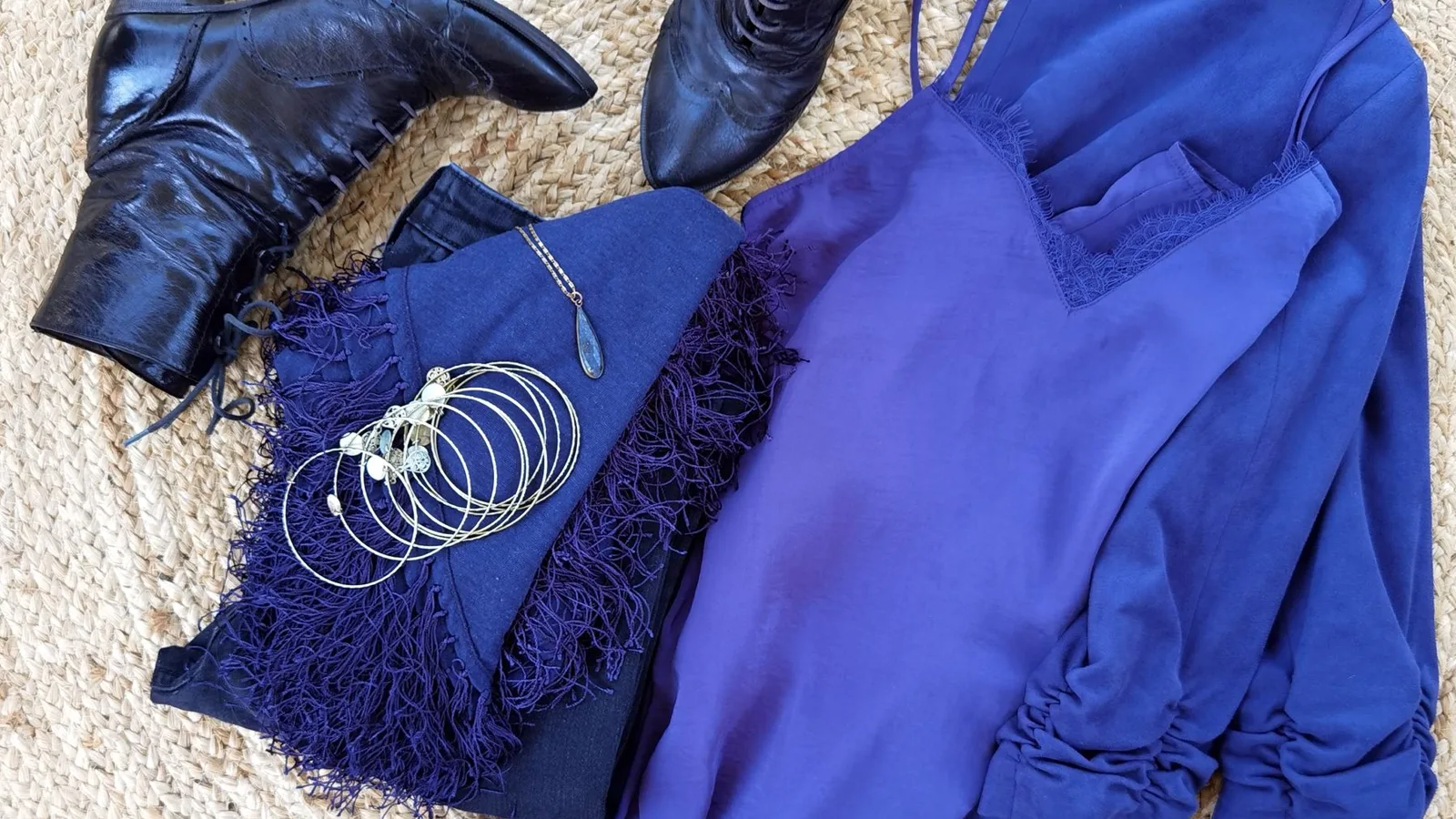
Wear three depths of one color family, a dusty pink coat, a rose knit, and blush trousers, for instance, and break it with exactly one neutral piece, white sneakers or a black bag. The neutral gives the eye somewhere to land so the outfit reads as a considered palette rather than a costume.
A worked example
Take a charcoal coat, a navy sweater, dark denim, and brown boots, a perfectly wearable but visually flat outfit with three cool neutrals and no color decision at all. Apply Rule No 1 and swap the boots for a pair in oxblood or add a rust-colored scarf: now the outfit has a true complement to navy doing a single, contained job. Apply Rule No 3 instead and the same coat becomes the anchor for an all-navy build, a navy coat, a slightly lighter chambray shirt, and indigo denim, broken by white sneakers so it does not read as a uniform. Same starting pieces, two entirely different color strategies, both correct, because the rule you pick depends on how much contrast you actually want that day.
This is also where building a working wardrobe pays off twice. If you are also narrowing down a 12-piece capsule, choosing your two or three core colors before you choose your pieces means every new item arrives already knowing which rule it belongs to, instead of becoming a color decision you have to solve fresh every morning.
The mistake that undoes all three rules
The single most common color harmony mistake is not clashing hues, it is clashing intensities. Two colors at full, equal saturation, a bright cobalt blue next to a bright tomato red, both fight for the same amount of attention with nothing muted to let either one lead. The fix is not to avoid bold color, it is to make sure only one piece in the outfit is doing the loudest work while everything else steps back and supports it. The same logic that makes a smart casual dinner outfit work, one polished element, one relaxed element, and nothing arguing with either, applies to color exactly the same way: one lead, one support, and the rest staying quiet.
Fabric and finish make this worse or better than the color alone suggests. A matte olive knit next to a glossy burgundy silk can clash even though the two colors are genuinely analogous on the wheel, because the shine difference reads as a second, competing contrast on top of the color one. When in doubt, matching the finish (both matte, or both with a little sheen) removes one variable and makes the color relationship easier to judge honestly.
Checking your own color harmony
The wheel and the three rules above will get an outfit most of the way there, but the final check is always the same one stylists actually rely on: look at the whole outfit at once, not piece by piece, and ask whether one color is clearly leading. If two pieces are arguing for the same amount of attention, the outfit will read as unresolved no matter how technically correct the pairing is on paper.
This is precisely the check Aurea is built to run. Photograph the finished outfit and it scores color harmony specifically, whether one color is leading the way the rules above describe, alongside fit and occasion match, and names the one adjustment that would fix it if something is off. It will not choose your palette for you, but it will tell you honestly whether the palette you chose is actually balanced before you leave the house.
Questions, answered
Do complementary colors always work in an outfit?
Only when one of the two leads and the other stays small. Two complementary colors at equal size and equal saturation compete for the eye instead of working together, which is why the accent piece, a bag, a scarf, a single knit, does most of the work.
Can a neutral count as one of my outfit's colors?
Treat a neutral as the anchor rather than a competing color. Camel, navy, charcoal, and white are doing color work, they are just quiet about it, which is exactly why they pair so easily with one bolder piece.
Does black really go with everything?
Mostly, but not for free. Black can flatten a warm palette and make it read as harsher than intended, so it works best paired with at least one warm accent, camel, rust, or gold, rather than worn as the only color decision in the outfit.
How many colors should one outfit actually have?
Two to three, including your neutrals, is the range that reads as considered rather than chaotic. A fourth color can work as a small accessory, but a fourth full garment is usually where an outfit starts to look assembled rather than chosen.