Undertone advice usually arrives as a single instruction: warm people wear gold, cool people wear silver, pick a lane and dress accordingly. That instruction is not wrong, it is just incomplete enough to send a genuinely neutral undertone chasing a category that was never going to flatter them, and to send a fair-skinned warm undertone away from colors that would have worked fine, on the mistaken assumption that light skin automatically means cool. Undertone is real and it does change which colors read as flattering rather than washed out, but getting it right takes more than one test and a confident guess.
Undertone is not the same as skin tone
Skin tone, or depth, is how light or dark skin is. Undertone is a separate property entirely: the underlying warmth or coolness of that skin, independent of how deep it runs. The two get conflated constantly because early color-analysis systems bundled them together, but they are genuinely separate axes. A fair undertone can be warm or cool. A deep undertone can be warm or cool. Knowing someone’s depth tells you nothing reliable about their undertone, and dressing as though it does is exactly how a fair-skinned warm undertone ends up in icy pastels that were only ever going to suit a cool one.
Once the two are separated, the actual question gets simpler: not “am I light or dark,” but “does my skin lean toward yellow and gold, or toward pink and blue.” That question is what the tests below are actually trying to answer.
The tests, and which ones actually hold up
Look at the veins on the inside of your wrist in natural daylight. Green-looking veins suggest a warm undertone; blue or purple-looking veins suggest cool. It works reasonably well on fair to medium skin, but it gets unreliable on deeper skin, where veins can read greenish regardless of undertone, and on olive skin, where a neutral, slightly green cast confuses the read either way.
Hold gold and silver against your jaw in the same light. Gold flattering more, brightening the skin, suggests warm. Silver flattering more suggests cool. Both looking about equally good is a genuine result, not an inconclusive one, and it usually means neutral. This test holds up more consistently across skin depths than the vein test does.
Hold a true, stark white fabric under your chin, then swap in a warm ivory or cream. If the stark white makes skin look brighter and more awake, that leans cool. If the ivory does that job instead, and the stark white looks slightly gray or sallow by comparison, that leans warm.
No single test is definitive on its own, which is exactly why relying on just one, usually the vein test, is where most people go wrong. Run two or three and see if they agree. When they do, trust the result. When they genuinely split three ways, that is usually the neutral answer showing up rather than a test failing.
Where “warm vs cool” undertone even came from
The warm-cool-neutral framework did not arrive with the beauty industry that popularized it. Carole Jackson’s 1980 book Color Me Beautiful is the reason the vocabulary is now common knowledge: it introduced a wide readership to a four-season system, winter and summer built around blue-based undertones, spring and autumn built around yellow-based ones, and it became enough of a bestseller to reach its 31st printing within three years. Jackson was building on earlier color theory work, including that of Bauhaus teacher Johannes Itten, rather than inventing the temperature concept from nothing, but her book is what turned it into something a shopper could actually apply with a swatch book in hand.
That four-season version bundled depth and temperature together in a way later color-analysis approaches have moved away from, splitting the two into separate, independent axes rather than one combined bucket. The tests above are really doing that separated version of the job: identifying temperature on its own, without smuggling in an assumption about how light or dark the skin also happens to be.
Dressing a warm undertone
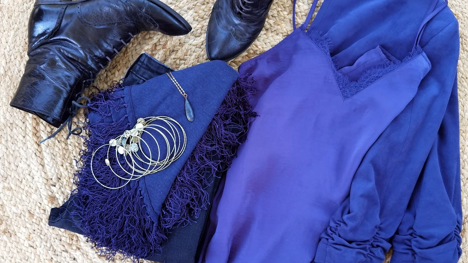
Camel, olive, mustard, rust, warm tomato red, gold jewelry, and an ivory or cream rather than a stark white. Warm-toned indigo denim, the slightly faded, less blue-black version, sits more easily against warm skin than a very dark, cool-cast denim does.
Navy still works on a warm undertone, it is dark enough to function as a near-neutral regardless of temperature, but it earns its keep fastest paired with a genuinely warm second color, camel or rust rather than ice blue or silver-gray. The same principle carries into any bold color choice: a warm undertone gets more out of a color that itself leans warm, gold-based rather than blue-based, even within the same general hue.
Dressing a cool undertone
True white, charcoal, silver-gray, sapphire and ice blue, emerald, cherry or berry red rather than tomato, and a cool blush pink. Silver jewelry reads as intentional here in a way gold rarely does.
The same red example that flatters a warm undertone in its tomato version flatters a cool undertone in its cherry or berry version, same general color family, different underlying temperature, and the difference is large enough to be the entire reason one red reads as glowing and the other reads as slightly off. Cool undertones can wear navy the same way warm ones do, it is dark enough to act as a neutral either way, but the icy or silver-toned pairings will read as more deliberate than the warm ones do.
Dressing a neutral undertone
A genuinely neutral undertone is not a wider version of warm or cool, it is a real third category, and it usually still has a slight lean even when both gold and silver look fine. The useful move for a neutral undertone is not assuming everything works equally well, it is identifying which way the lean actually goes at the extremes: does a true tomato red or a true cherry red look marginally better, does gold or silver read as marginally more intentional. That marginal lean is worth dressing toward even if the difference is small enough that either family is wearable.
A worked example: one red, two undertones
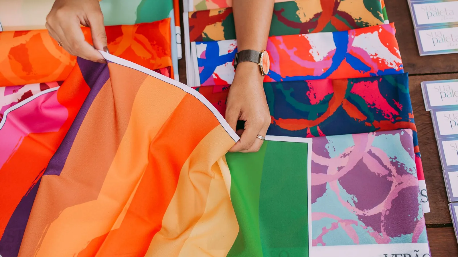
Take a single garment, a red sweater, and hold it up against a warm and a cool undertone in turn. Against a warm undertone, a tomato or brick-based red looks rich and makes the skin look warmer and more lit from within; the same sweater in a blue-based cherry red looks slightly harsh against the same skin, fighting the undertone rather than complementing it. Flip to a cool undertone and the read reverses exactly: the cherry red looks vivid and clean, while the tomato red looks faintly muddy, like it is competing with the skin’s own warmth instead of sitting against it.
Neither red is objectively the better color. The undertone underneath it is what decides which version earns the compliment and which version quietly works against the wearer, which is exactly why “red is a great color on everyone” is true and useless at the same time: it is true of red in general and false of most specific reds for most specific people.
The one mistake to avoid
The single most common undertone mistake is assuming it from depth: fair skin gets assumed cool, deep skin gets assumed warm, and both assumptions are wrong often enough to matter. A fair, warm undertone in an icy lavender or a cool silver-gray will look washed out for the same reason a deep, cool undertone will look muted in mustard or rust: the color is fighting the actual temperature of the skin, and depth was never a reliable stand-in for that temperature to begin with. Test undertone on its own terms, independent of how light or dark the skin also happens to be, and the guesswork mostly disappears.
Checking the final look
Once undertone is identified and the palette above is narrowed down, the check that matters is the same one that matters for any color decision: does the finished outfit make the skin look brighter and more awake, or does it sit there technically correct on paper while quietly doing nothing for the person wearing it. Undertone theory gets you to the right neighborhood; the mirror is still what confirms the specific house.
This is exactly the kind of check Aurea is built to run before you leave. Photograph the finished outfit, and it scores color harmony, fit and proportion, and occasion match in about thirty seconds, the same read whether the color question is about undertone, a capsule’s core palette, or a single bold piece. It will not test your undertone for you, but it will tell you honestly whether the color you chose is actually working before you walk out the door.
Questions, answered
Is everyone's undertone either warm or cool?
No. A genuinely neutral undertone is common, and it means gold and silver, or a warm red and a cool red, look roughly equally good rather than one clearly winning. Neutral is a real third category, not a failure to identify warm or cool.
Does a tan or a change in season change my undertone?
It changes your depth, how light or dark your skin is, not your undertone, which is the underlying temperature of that skin. A tanned warm undertone is still warm, just at a deeper depth, so the colors that flattered you before a tan usually still do, just possibly a shade richer.
Can a fair-skinned person have a warm undertone, or a deep-skinned person have a cool one?
Yes, and this is the most common mix-up. Depth and undertone are independent: plenty of fair skin runs cool, plenty of fair skin runs warm, and the same split exists at every depth in between and beyond. Never assume undertone from how light or dark someone is.
What if the vein test and the jewelry test disagree?
Try a third check, holding true white and warm ivory fabric under your chin in natural light, and see which one makes your skin look brighter rather than sallow or gray. When two of your three tests agree, trust that answer; a genuine three-way split usually means you are neutral.