Every “true” season in the twelve-season color system has a quieter, more accurate name: Cool Winter and Cool Summer. The twelve-season system already lists both of them, as the one “pure” member of each cool family that carries its family’s temperature without borrowing brightness, depth, lightness, or softness from a neighboring family. That anchor piece never stopped to dress either one on its own, the way Deep Autumn and Deep Winter already got that treatment as the system’s two deepest seasons. True Winter and True Summer deserve the same specific pass, not because they are exotic, but because “purest cool” is a genuinely different instruction to shop from than “deepest” or “brightest,” and most general color-season content never gets more specific than the family name.
What “true” actually means here
A twelve-season family splits into three seasons along two extra axes beyond temperature: one season borrows brightness or lightness from a neighboring warm family, one borrows depth or softness from the other neighboring family, and one carries the family’s temperature at a middling depth and contrast, with nothing borrowed at all. That third season is the “true” or “pure” one, and it is why Winter’s three members are Bright Winter, True Winter, and Deep Winter, while Summer’s three are Light Summer, True Summer, and Soft Summer. True Winter and True Summer are each their family’s anchor point, not a compromise between the other two.
True Winter: cool, with the winter family's naturally higher contrast, spanning true black to true white without Deep Winter's added richness or Bright Winter's maximum saturation. True Summer: cool, with the summer family's naturally softer, lower contrast, built on muted blues, greys, and dusty tones without Light Summer's pastel paleness or Soft Summer's grayed-down muting.
Both seasons share one thing that separates them from every warm season on the map: nothing in either palette carries a trace of yellow. A warm season can wear a cooled-down version of its own family’s colors and still look fine; a true season generally cannot, because pulling any warmth into either palette fights the exact quality that makes it work.
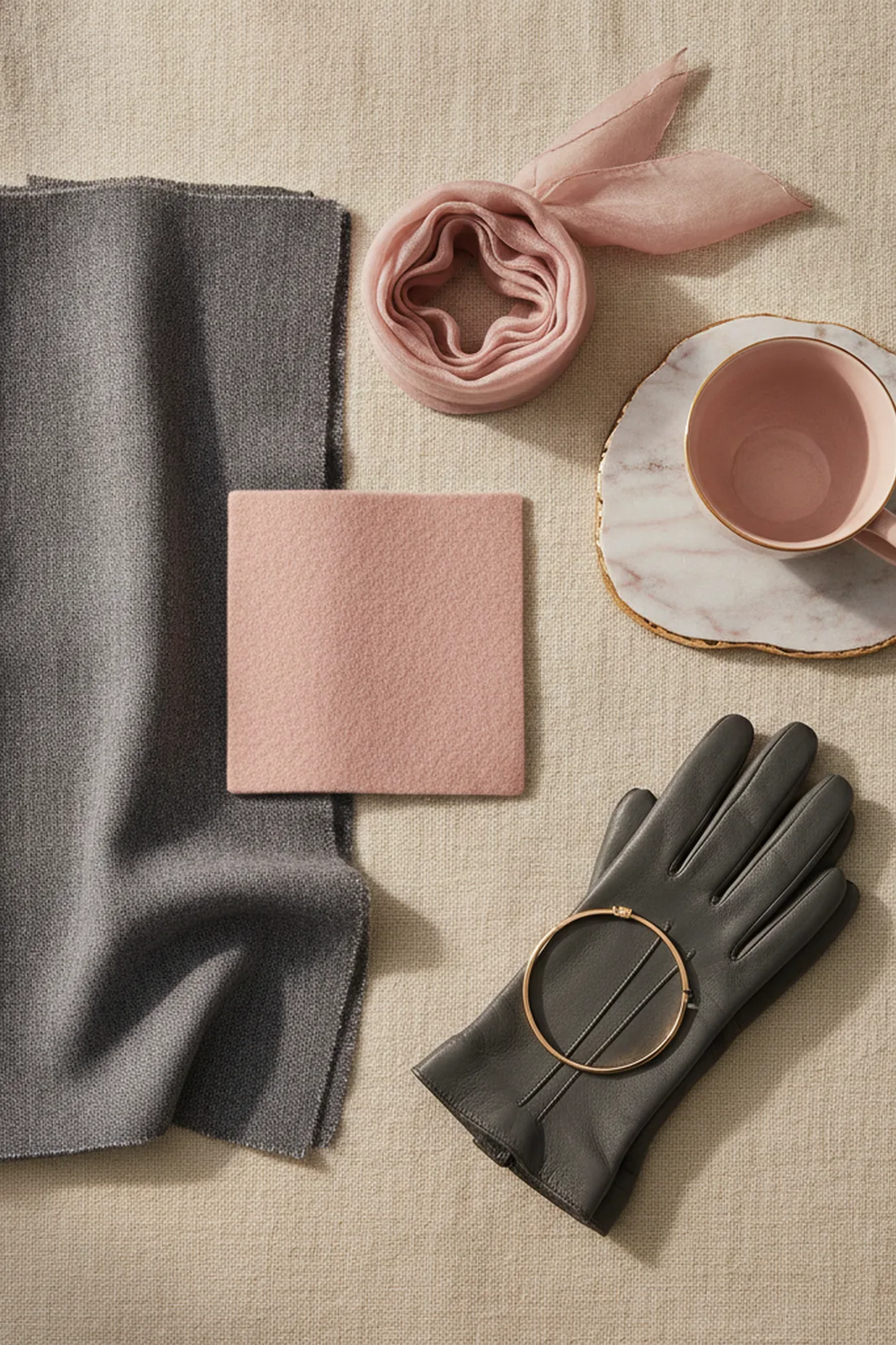
Image: Aurea studio.
Dressing True Winter
True Winter sits at the winter family’s most balanced point: cool, clear, and confidently high-contrast, without reaching for Deep Winter’s darkest, richest saturation or Bright Winter’s most electric brightness.
True black and true white used at full strength, cool blues, sapphire, icy pink, and a clear, cool red. Dark neutrals lean toward charcoal and cool-based browns rather than warm chocolate. Silver and platinum are this season's metals; gold reads as a visible mismatch against True Winter's cool base rather than a neutral choice.
A working True Winter outfit leans on that same contrast rather than smoothing it out: a charcoal wool coat over a true white shirt, finished with a sapphire scarf and silver jewelry, uses the family’s natural high contrast the way the palette is built to be worn. The mistake to avoid is reaching for warm, earthy neutrals, camel, rust, warm chocolate, as a “safe” base. Those colors are not muted versions of True Winter’s palette, they are a different temperature entirely, and they will read as slightly off no matter how well the rest of the outfit is built.
Dressing True Summer
True Summer sits at the summer family’s most balanced point too, but “balanced” means something softer here than it does for winter: cool, gentle, and never as high-contrast as its winter cousin.
Dusty blue, soft turquoise, cool grey, muted rose, and a soft, cool-based red, none of them pushed to full saturation. Neutrals run to soft greys, cool taupe, and a grey-based navy rather than true black or stark white, both of which read as too harsh against this season's gentler contrast. Silver, white gold, and platinum are the metals that work; yellow gold clashes the same way it does for True Winter.
An outfit built for True Summer works best when every piece stays in that same gentle register: a dove-grey knit, soft denim in a cool, faded wash, and a dusty rose scarf reads as considered here precisely because nothing in it is fighting the season’s naturally low contrast. The mistake to avoid is reaching for true black or bright white to “anchor” the outfit the way a higher-contrast season would. Both read as harsh against True Summer’s coloring, flattening the softness that is the actual point of the palette rather than grounding it.
Telling the two apart when temperature will not do it
Because both seasons are equally, fully cool, the vein test and the jewelry test will not separate them, and trying to use temperature to tell True Winter from True Summer is the wrong tool entirely. Contrast is the variable that actually distinguishes them.
Hold a high-contrast combination, true black next to true white, against your face, then hold a low-contrast combination, dove grey next to dusty rose, against it in the same light. If the stark black-and-white pairing makes your features look sharper and more defined, that points to True Winter. If it looks harsh and the softer grey-and-rose pairing looks more alive by comparison, that points to True Summer. Undertone is not the question here, since both seasons already share it; contrast is the only variable still open.
This is the same logic Deep Autumn and Deep Winter uses to separate a shared property from the one that actually varies, just run on contrast instead of temperature. It also tends to resolve faster than an undertone test, because a stark black-and-white pairing against the face rarely reads as neutral: it either sharpens or overwhelms, and that reaction is the tell.
The mistake that undoes both palettes
The single most common mistake with either true season is treating “true” as a synonym for basic and reaching for whatever neutral is on hand rather than checking it against the palette’s actual temperature and contrast. A warm camel coat on a True Winter, or a stark white blouse on a True Summer, is not a safe, versatile choice, it is a colour that is fighting the coloring underneath it in exactly the axis that season is built around, temperature for the camel, contrast for the white. Neither substitution is wrong to own generally, it just needs to go to someone whose season it actually matches rather than getting treated as a universal neutral.
Image: Aurea studio.
Checking the final look
Knowing you are True Winter or True Summer narrows the palette to the family’s purest expression of it; it does not replace the mirror. The final check is the same one that matters for any color decision: does the outfit make your skin look brighter and more awake at the right contrast level, or does it sit there technically cool while reading flat or harsh instead.
This is exactly the check Aurea is built to run. Photograph the finished outfit, and it scores color harmony, fit and proportion, and occasion match in about thirty seconds, the same read whether the question is a full season’s palette, a single cool accent, or a neutral base. It will not run your color analysis for you, but it will tell you honestly whether the temperature and contrast you chose are actually working before you leave the house.
Questions, answered
Is True Winter the same thing as Cool Winter?
Yes. True Winter and Cool Winter are two names for the same season in the twelve-season system, the winter family's pure, family-defining member. Some color analysts use True, others use Cool; the palette underneath does not change.
Is True Summer the same thing as Cool Summer?
Yes, for the same reason as True Winter. True Summer and Cool Summer both describe the summer family's purest cool member, sitting between Light Summer and Soft Summer. It is a naming difference between color-analysis schools, not two different seasons.
If True Winter and True Summer are both cool, how do I tell them apart?
By contrast, not temperature. True Winter carries the winter family's higher contrast and reaches toward true black and true white, while True Summer carries the summer family's softer, lower contrast and never goes fully black or stark white. Hold a high-contrast outfit and a soft, blended one against your face and see which one makes your features look sharper rather than harsher.
Can a tan or a fresh hair color make me look like the wrong one of the two?
It can make the self-check less reliable, since a tan temporarily raises depth and a dye job can mask your natural contrast. Re-run the comparison with your natural hair color and undertanned skin if the two seasons seem to be tied.